Pilot Networkbrand identity and visual system — Before our current modern cybersecurity era, this infrastructure innovator kept enterprise networks secure. I led a complete top-to-bottom rebrand, building a cohesive visual system designed to convey trust and digital defense. It showcases the strategy behind transforming a highly technical legacy brand into a bold, memorable powerhouse.
Web, print & environments
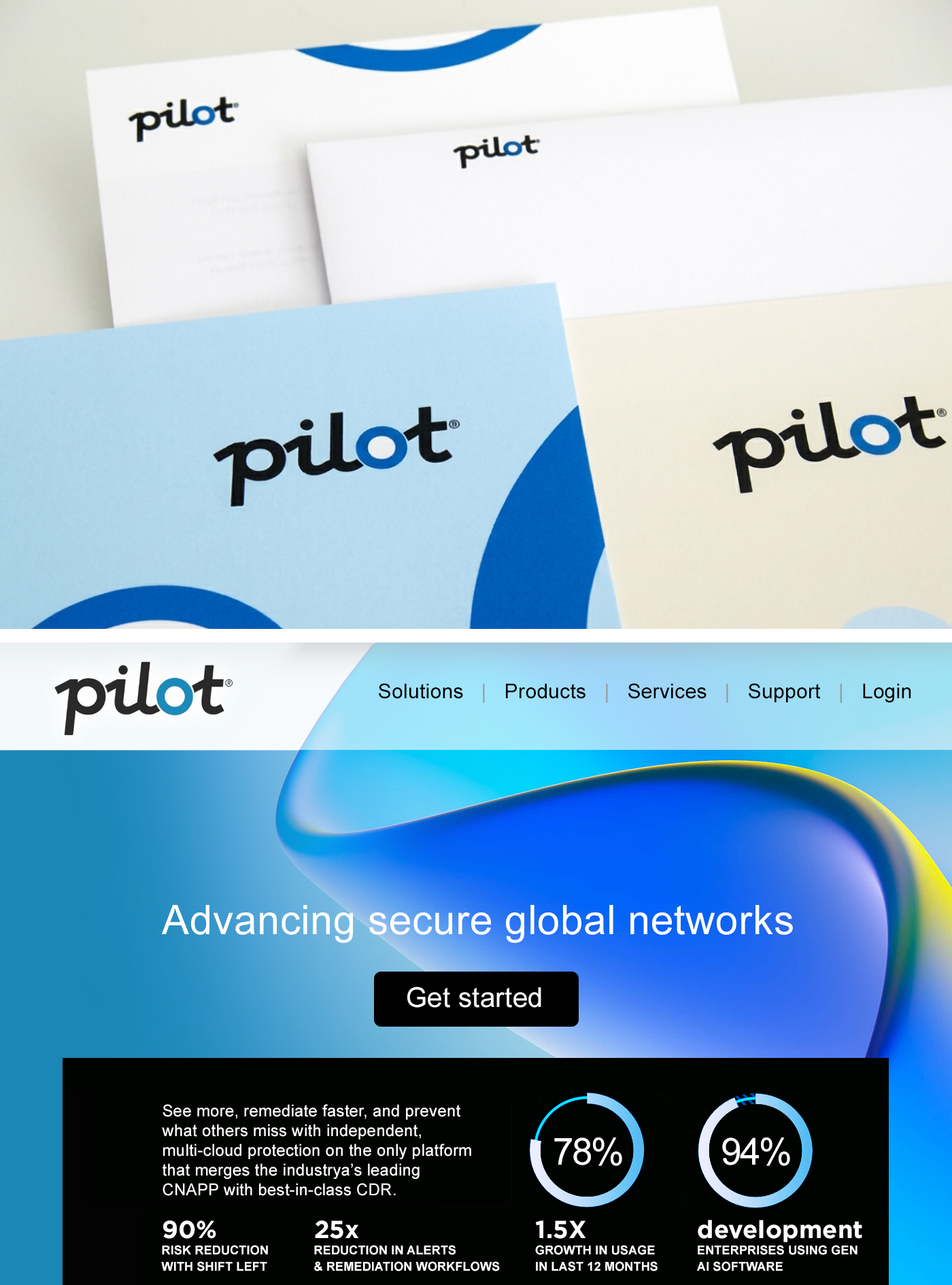
I delivered a comprehensive brand redesign spanning across corporate stationery, marketing collateral, and a modern web UI. By leveraging bold typography and and intuitive layout, the design transformed a highly technical ecosystem into a sleek, high-trust digital presence.
Athletic branding
Jack London Aquatic Centerbrand identity and visual system — I created a bold, timeless logo and full brand identity system for a premier rowing club in Oakland, California. Built to perform across every touchpoint, the flexible visual language unified the club’s presence on the water and off. It works across team uniforms, websites, social media, brochures, and donor materials.
Mission-driven & nonprofit
United Nations Womenbrand identity and visual system — The UN Women mark is rich in symbolism, which combines four recognizable symbols: the UN logo, the globe, the women’s symbol, and the equal sign. The mark is divided into two halves, represented by different shades of blue, and connected by the equal sign. The symbolism of the mark expresses the organization’s commitment to creating a world in which women and men are equal. In addition, the mark needed to be highly legible across all media both on screen and in print, large and small, and translated into many languages.
Web, print & environments
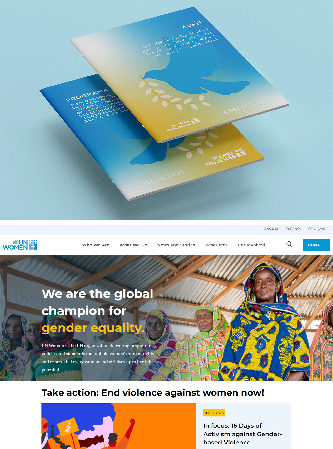
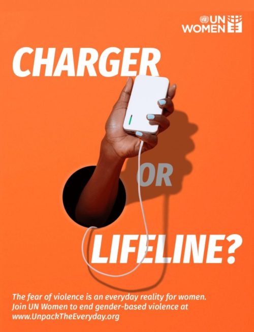
A comprehensive visual redesign and guidelines were built to transform the digital and physical footprint of this global champion for gender equality. The system seamlessly adapts across diverse creative touch points, bridging impactful print campaign literature with a unified web experience.
Architecture & engineering branding
Paradigm SEbrand identity and visual system — The structural engineering firm’s visual identity received a much needed modernization that is centered around a bold, architecture inspired logo. By pairing clean typography with an intuitive layout, the design transforms a complex engineering ecosystem into a sleek, high-trust presence that commands attention.
Web, print & environments
The visual identity seamlessly scales across a multi-channel ecosystem, bridging physical environments with a strong digital presence. The bold brand system adapts to diverse touchpoints, creating an unmistakable and cohesive look across environmental signage, truck graphics, corporate stationery, support graphics, clothing, and the website.
Fortune 100 branding
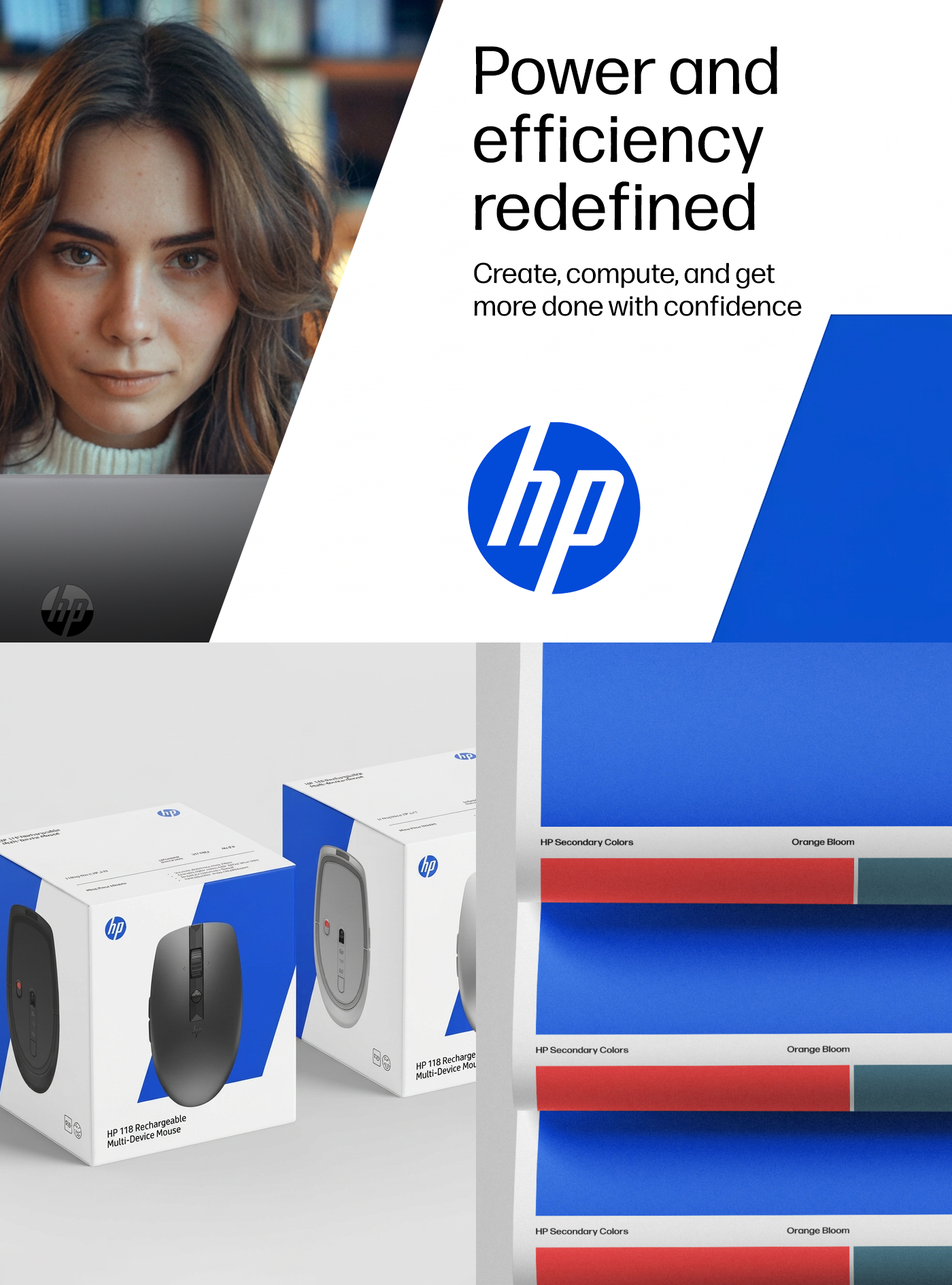
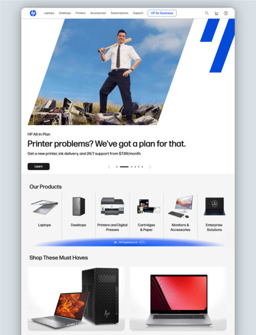
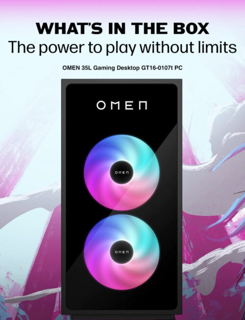
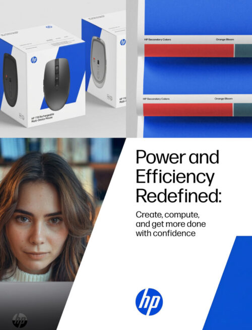
HPbrand identity and visual system refresh — A global rebrand unified a massive consumer technology ecosystem through a clean, modern design language that was inspired by the HP logo and HP legacy. We balanced clear and bold typography with an intuitive layout where the system transforms a complex hardware landscape into a clean, high-trust digital and physical presence.
Web, marketing & environments
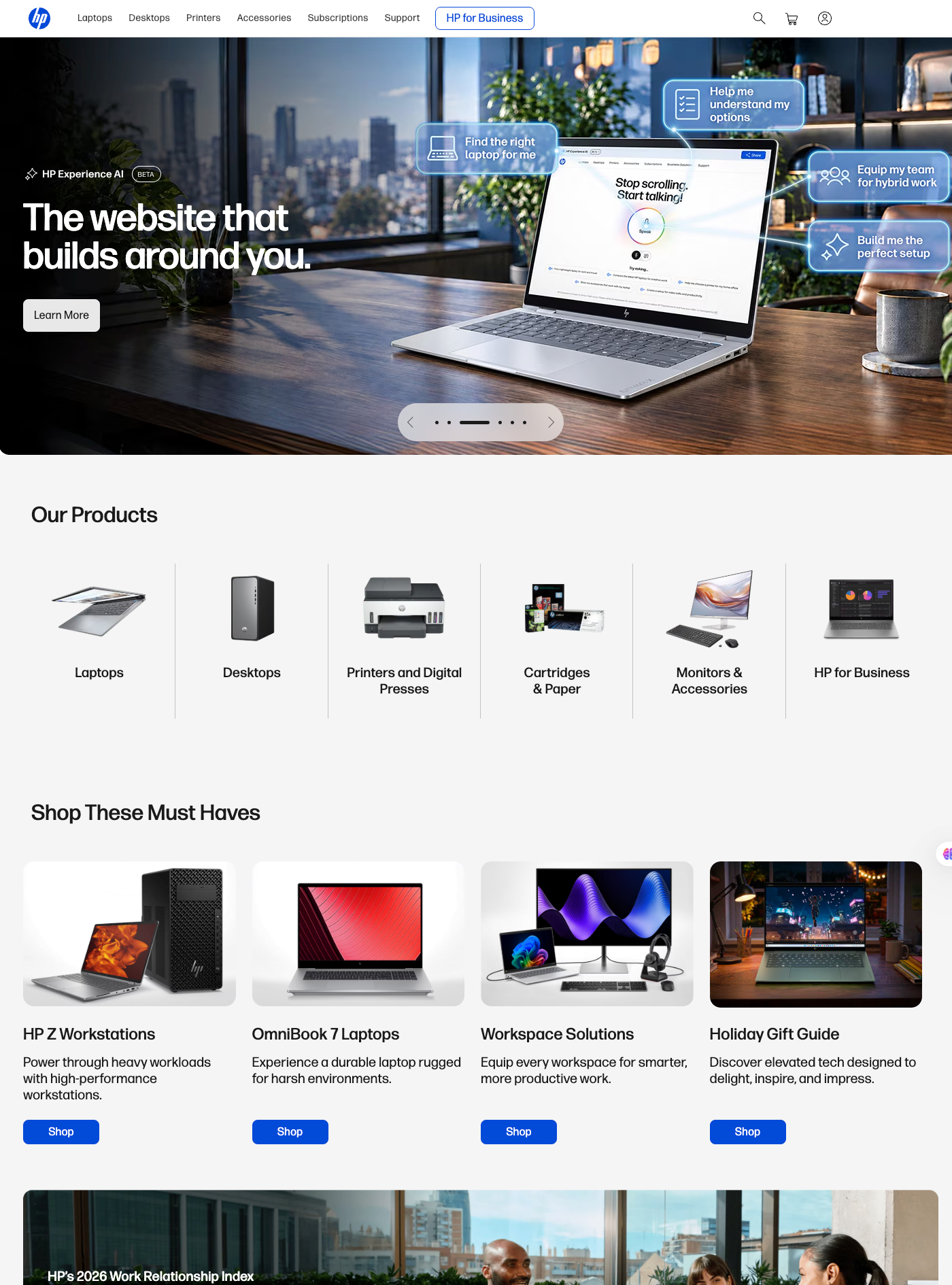
The global brand refresh seamlessly extended into a modern, unified e-commerce experience across the entire digital storefront. By pairing clean typography with an intuitive layout, the design transforms a massive product catalog into a sleek, high-trust online environment built for effortless navigation.
Boutique type foundry
Typebox, LLCbrand identity design — I created a comprehensive brand identity that honors the clarity and craft of this California-based digital typefoundry. Driven by the core philosophy of “mind, heart and hand,” the visual system connected the worlds of typography, graphic design, and cartography. It creates an expansive, lively presence that perfectly bridges digital technology with analog methods to amplify the studio’s deep creative vision.
Online & print marketing
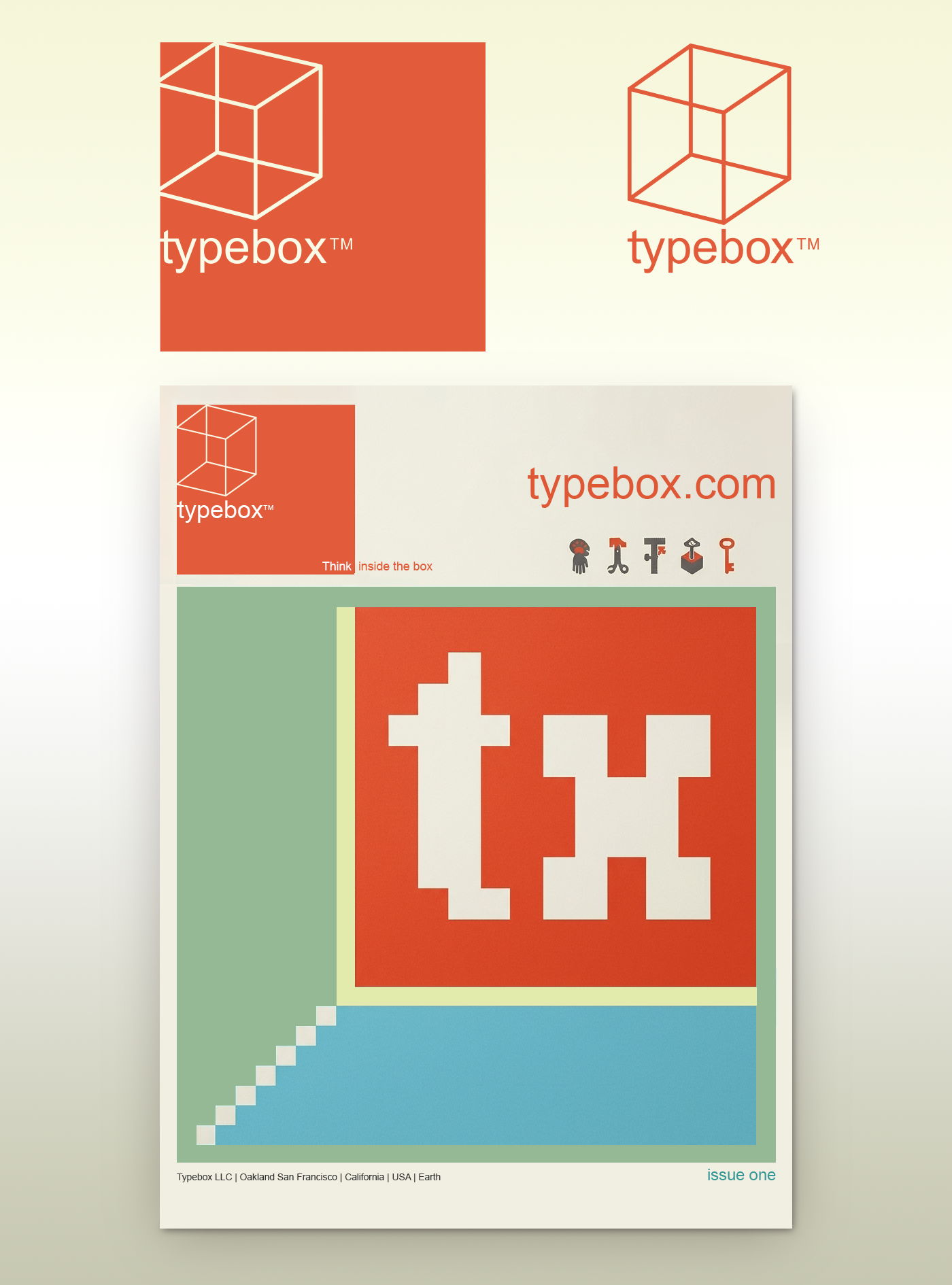
I applied this visual identity system to a promotional catalog and magazine designed to showcase the type foundry’s unique font designs. The editorial layout highlights the expressive typography, custom icon sets, and multi-dimensional geometric marks across strong architectural grids, creating a striking print piece for the design industry and font lovers alike.
Sub-brand identity
O’Reilly Mediasub-brand identity design — I created a strategic sub-brand identity for O’Reilly Media’s future technology and innovation venture program, where I captured the spirit of forward momentum and new ideas. The system centers around a bold, geometric paper airplane mark that transforms the master brand’s established presence into a dynamic visual language engineered to promote modern startups and technological innovators.