HP Store
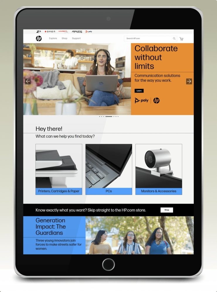
HP Store site design
All projects are devoted to the improvement and redesign of HP’s United States online store. Projects involve creating better shopping experiences, optimizing brand presentation, and promoting HP product and services promotion. Process development and improvement is also a very big part of the work.
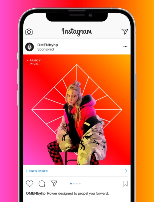
Customers are always first, and their journeys through the site from the multiple marketing channels is priority. Design for the channels include email marketing, SEO, web display campaigns, social media, blog, newsletters, and nurture campaigns.
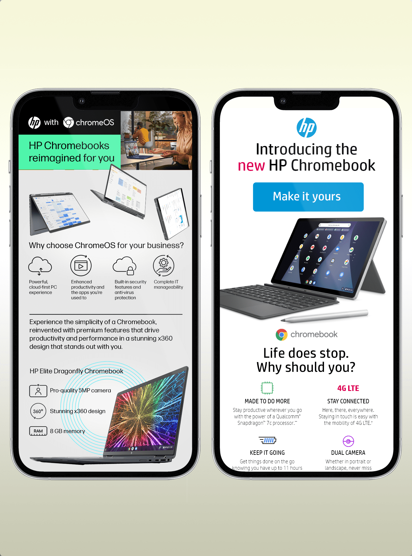
Mobile design and marketing
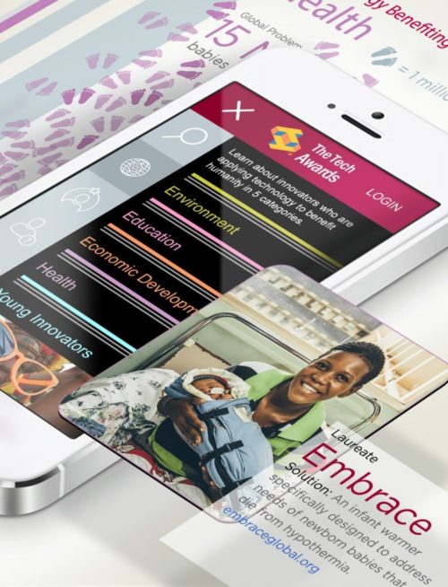
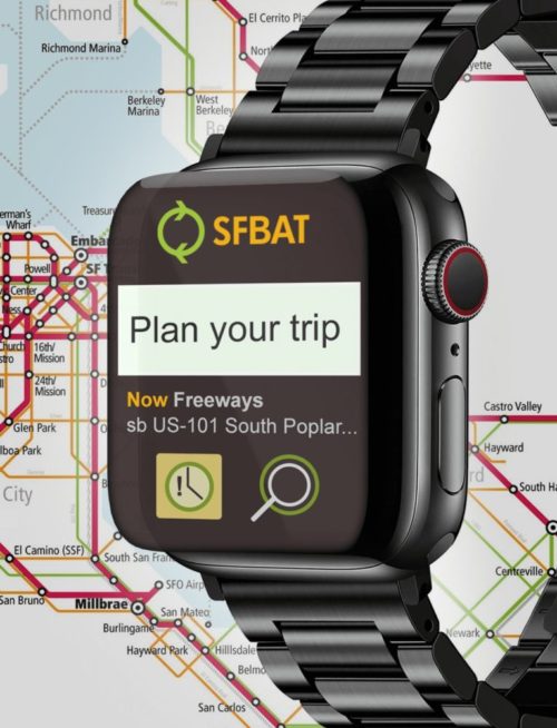
The example screens represented in the image (left) show our most informationally dense designs. Design was formatted first to be optimal according to mobile specifications.

Advertising & Copywriting
HP Store projects also include copy creation and writing consumer messaging. Almost all advertising done for the HP Store is managed by a small team. We are in a constant state of motion, as we invent, explore, experiment, and test many concepts with the mission to increase customer engagement.
My team and I have written several types of messaging. This includes theme creation, short copy, informational content development, persuasive writing, and mastering tone of voice. Creating email subject lines and button call-to-action text is the core, and most critical aspect of content creation.
Testing & Analytics
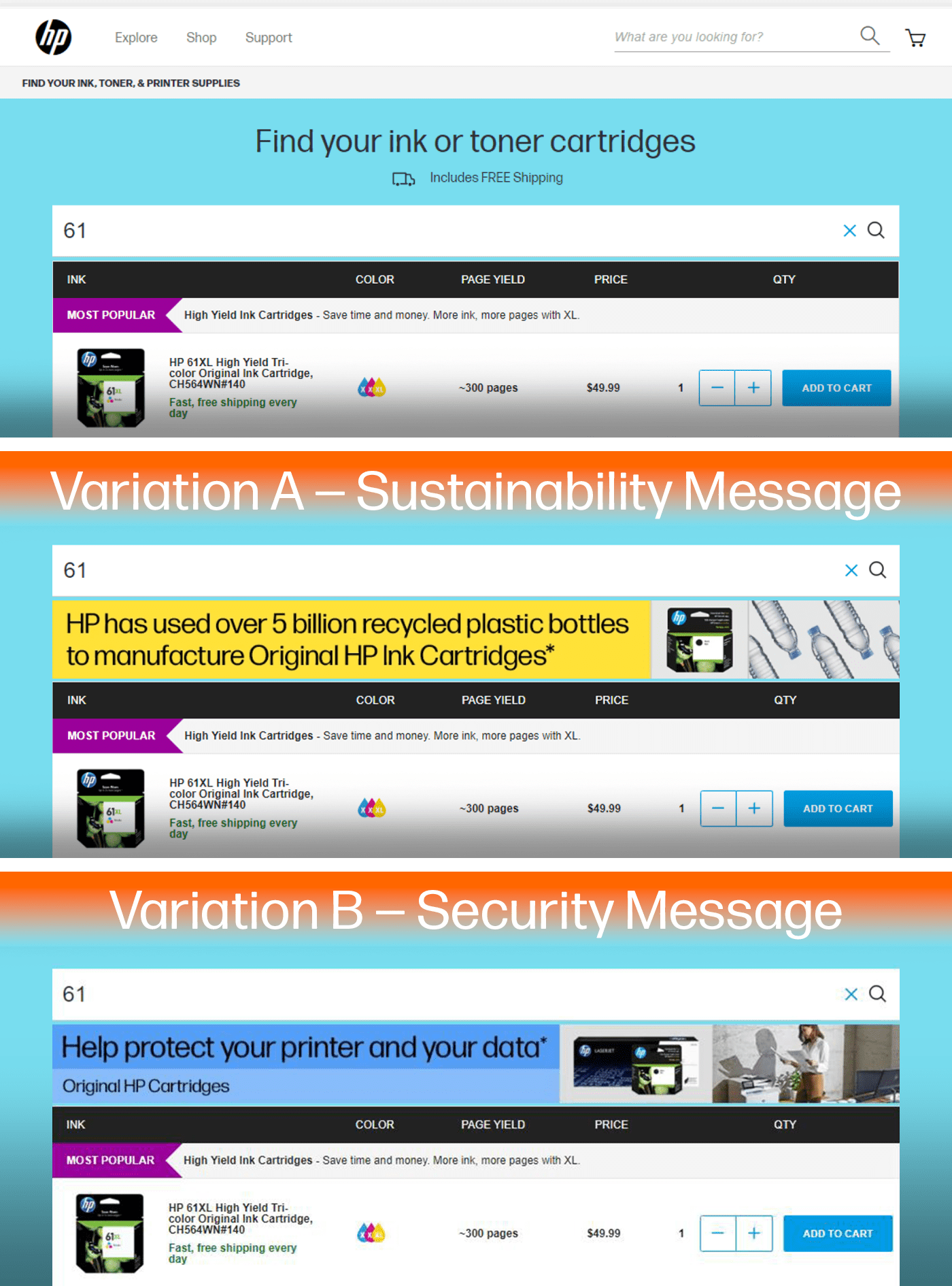
We are constantly testing and reviewing data to improve customer engagement. HP primarily uses Power BI, Tableau, and Optimizely for data analytics. Testing is done several ways, but the common A-B-C test method is our most common approach. Email design tests are executed using our email builder tools Salesforce Content Builder, Movable Ink, and or Stensul.
We utilize the analytics that are available so we can continue to hone and improve our strategy to achieve optimal results. The goal is to reach, engage and turn targeted prospects into loyal, paying customers.
The example (left) is a hypothesis that we believe that adding a banner into HP’s Ink Supplies Finder results will reinforce the key benefits of HP Original Ink. This will increase ink cartridges being added to cart from the supplies finder results, and ultimately higher overall ink conversion.

A refreshed brand
5 strategic principles were key parts within the development of HP’s new brand. [1] Keep it short and sweet: By nature, people who are using their mobile devices are on the go, which means they don’t have the time or patience to scroll through massive content. [2] Make an impact quickly: We only have a few precious seconds to get users attention and deliver our message. [3] Leverage video and animation to our advantage: More than half of all video content produced today is consumed on mobile devices. [4] Get social: Roughly one in five minutes of all digital media time is spent on social networks. [5] Keep things relevant: We don’t want to annoy users, which would paint HP in a negative light and have the opposite effect of what HP is trying to achieve.
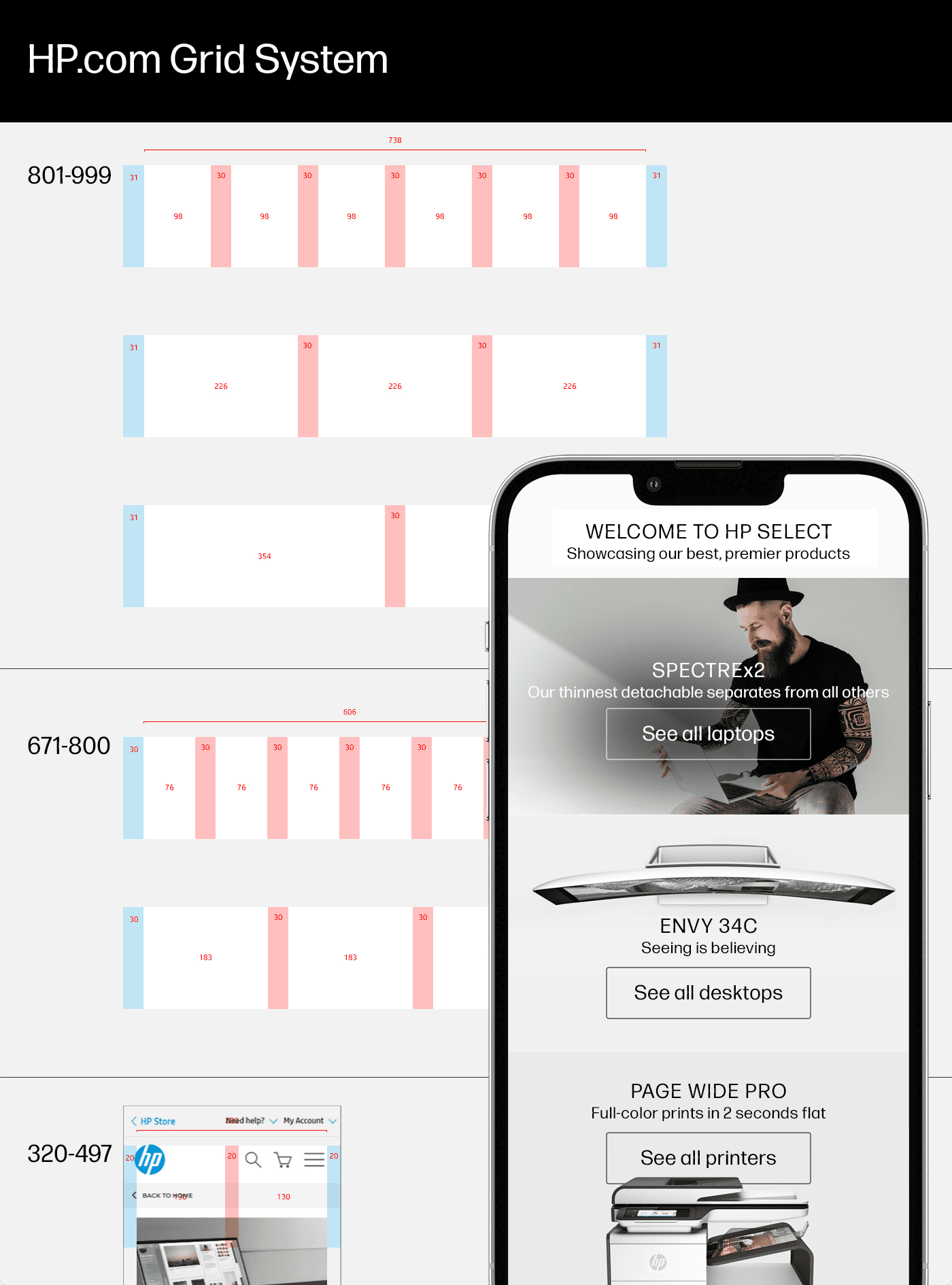
Mobile first design
This means thinking primarily about mobile considerations for the design. We use responsive design to ensure that all experiences are positive on all devices. Responsive design uses media queries to change the design based on the device where it is opened.
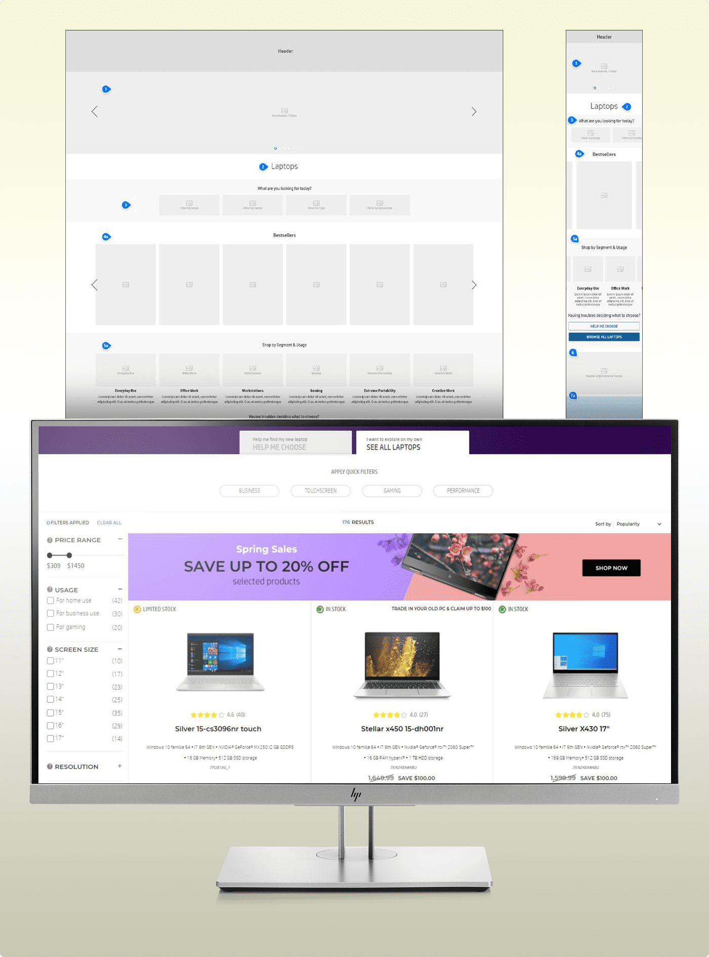
HP Store responsive design
We depend on responsive design to ensure that all online experiences, in particular mobile, are positive on all devices. A few of the mobile design considerations start by defining which pixel width will switch rendering to mobile view. Then we address column stacking by defining whether columns stack left to right, right to left, or remain fixed on mobile. It is also important to set desktop & mobile background images, specify padding, and ensure that line breaks occur in a logical and visually appropriate place on any device.
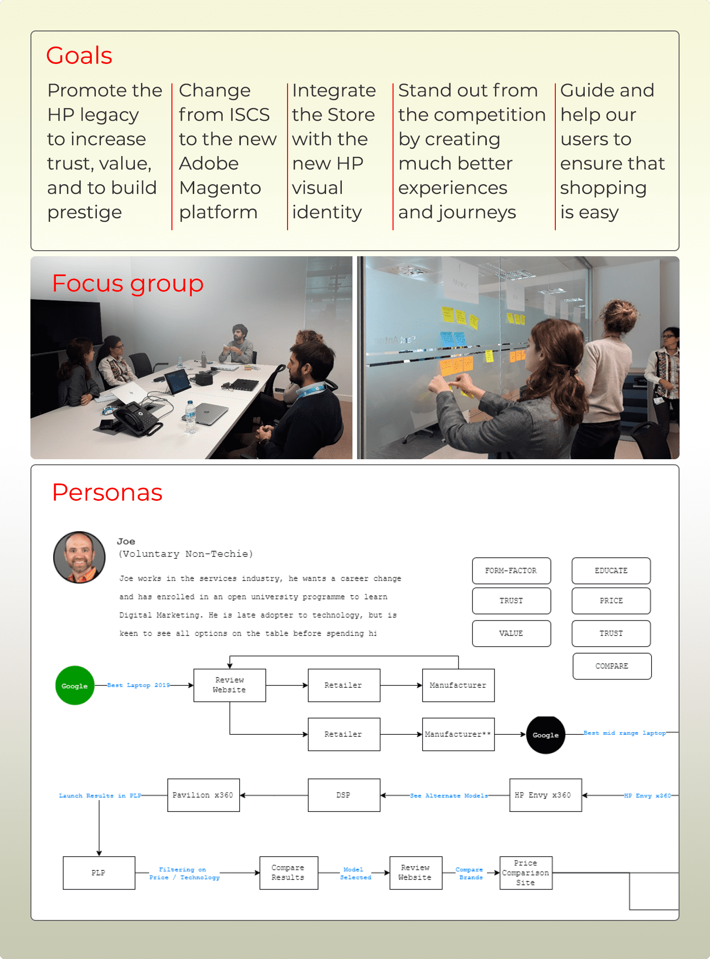
Ideation process
At HP we practice an iterative process [Design Thinking] to understand the user, challenge assumptions, and redefine problems. This solution-based approach allows us to identify alternative strategies and solutions that might not be instantly apparent. After the first two steps of empathizing with users and defining users’ needs, problems, and insights, we ideate by challenging assumptions and creating ideas for innovative solutions. This leads to prototyping creative solutions and testing them. Left example illustrates the stages of setting goals, implementing focus groups, and creating personas for work developing a new shopping experience
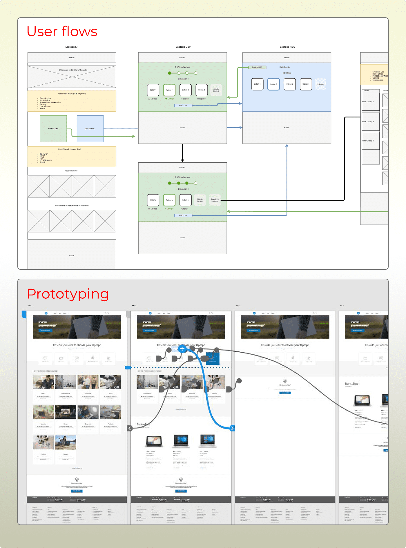
User flows and prototyping
The left example highlights user flow experimentation to visualize complete journeys and steps that a user takes to complete a task. These flows created as wireframes ultimately become prototypes, which can be used to study behavoir with design (test imagery and messaging).
Our interactive prototypes allow users to navigate from each page of a design and perform motion and transitions. It is the best, most realistic way to test designs and journeys across many devices.
