S.F. Bay Area Transit

The Challenge
The institutional setup of Bay Area public transit is arguably the most complex in the U.S. Riders navigate more than two dozen unique public transit “brands,” including Muni, BART, AC Transit, the Santa Clara Valley Transportation Authority (VTA), Caltrain and many other bus, rail and ferry operators. Each transit agency operates and plans its system independently and has different funding sources.
This project addresses the fact that riders face barriers on trips run by multiple operators, including unfamiliar maps and timetables, multiple fares, schedules that are not coordinated for transfers and long walks between transit connections. Riders also don’t know how to take advantage of all the transit that operates in their city.
This project addresses the fact that riders face barriers on trips run by multiple operators, including unfamiliar maps and timetables, multiple fares, schedules that are not coordinated for transfers and long walks between transit connections. Riders also don’t know how to take advantage of all the transit that operates in their city.
Product application design
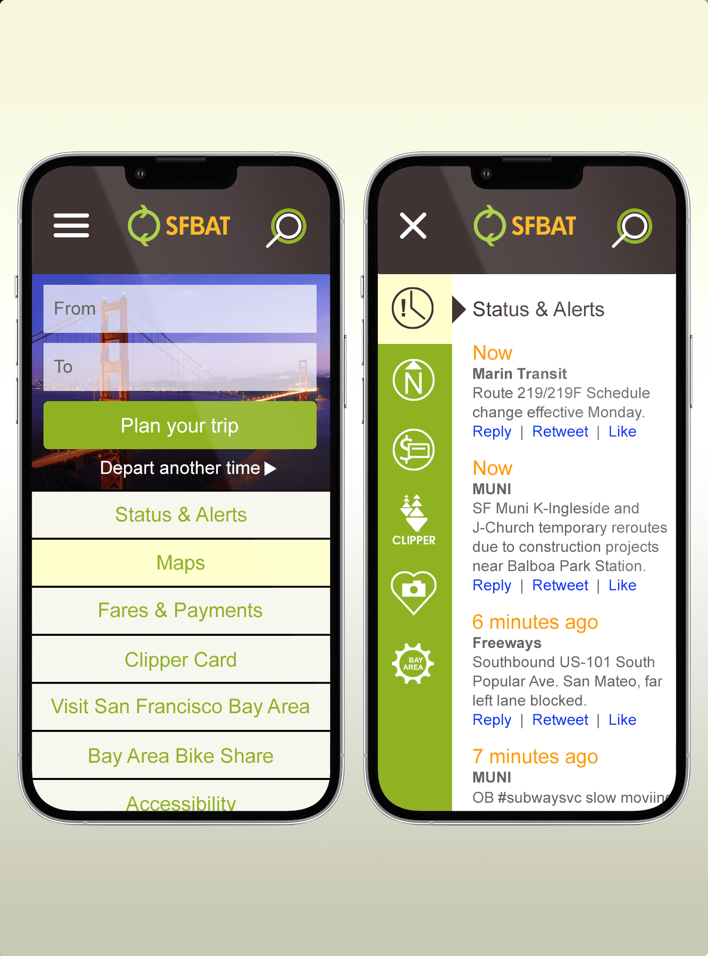
An application design was inspired by this problem. The goal is to create a portal that integrates the region’s many transit options and function like one system from a user point of view.
Prototypes (left) illustrate a concept to have an iconic regional transit app that is integrated with other regional transit programs such as Clipper and 511. Ideally, this comes with more consistency in transit service information across operators. Open data would enable third-party solutions like Routesy, NextBus and others to help explain the transit system for specific types of travelers.
Prototypes (left) illustrate a concept to have an iconic regional transit app that is integrated with other regional transit programs such as Clipper and 511. Ideally, this comes with more consistency in transit service information across operators. Open data would enable third-party solutions like Routesy, NextBus and others to help explain the transit system for specific types of travelers.
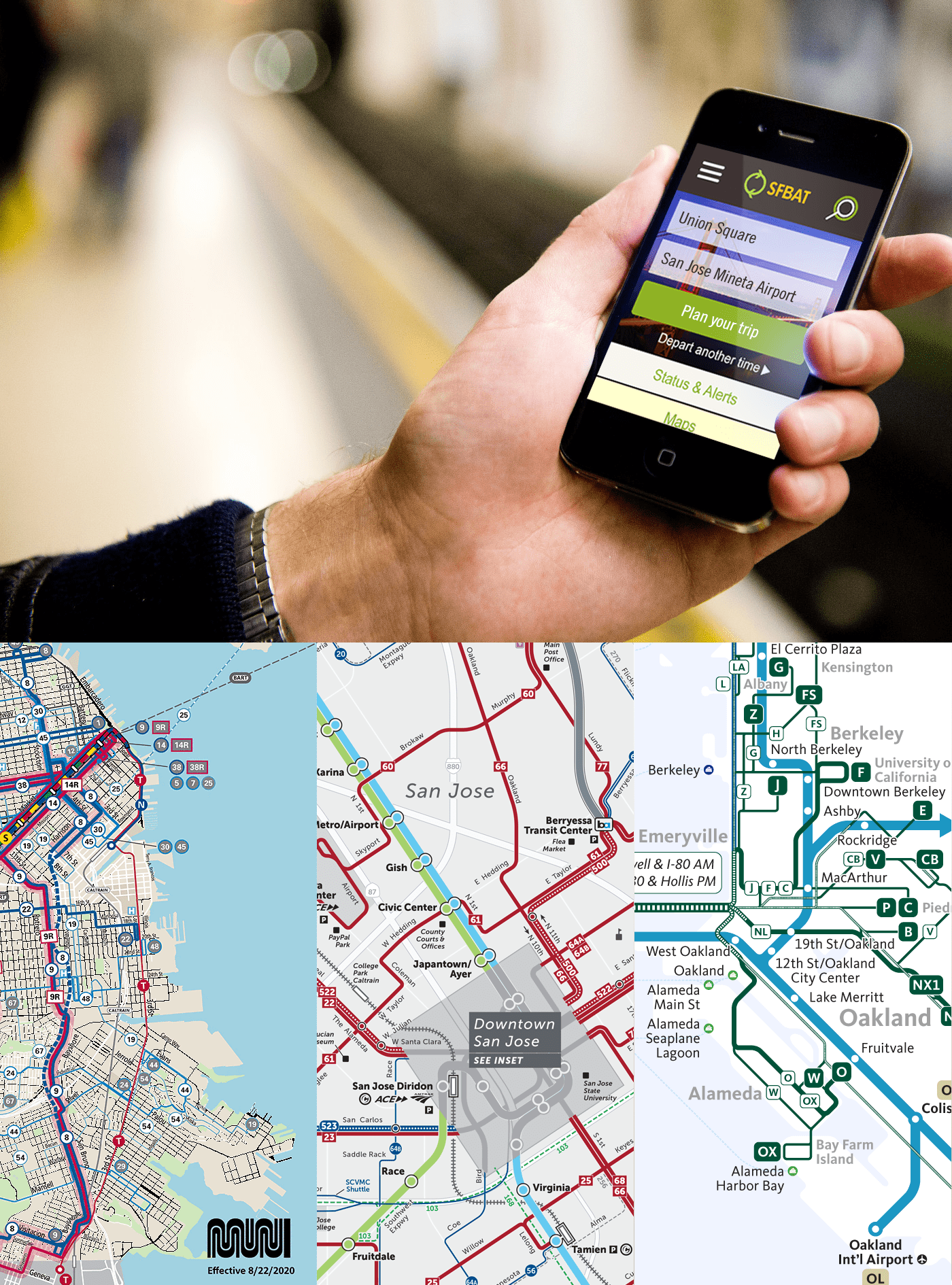
Combining 26 systems into 1
There is great interest in consolidating the Bay Area regional transit agencies, but many outside resources are still needed to move the conversation forward. Our initial research has found that better access to data and better tools to evaluate problems and prioritize solutions would help transit agencies seize many opportunities to provide a more integrated customer experience. The example (left) shows how the SFBAT app portal creates a singular, unified customer experience.
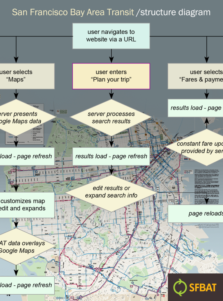
Research & User flows
The project began by undertaking massive information and data collection. This enabled the implementation of extensive flow experimentation to visualize complete journeys and steps that a user might take to plan a trip, get updates, maintain fare accounts, and find useful information. Flow diagrams led to wireframe creations, which ultimately became prototypes. There we studied the behavior with design and tested the visual design and messaging.
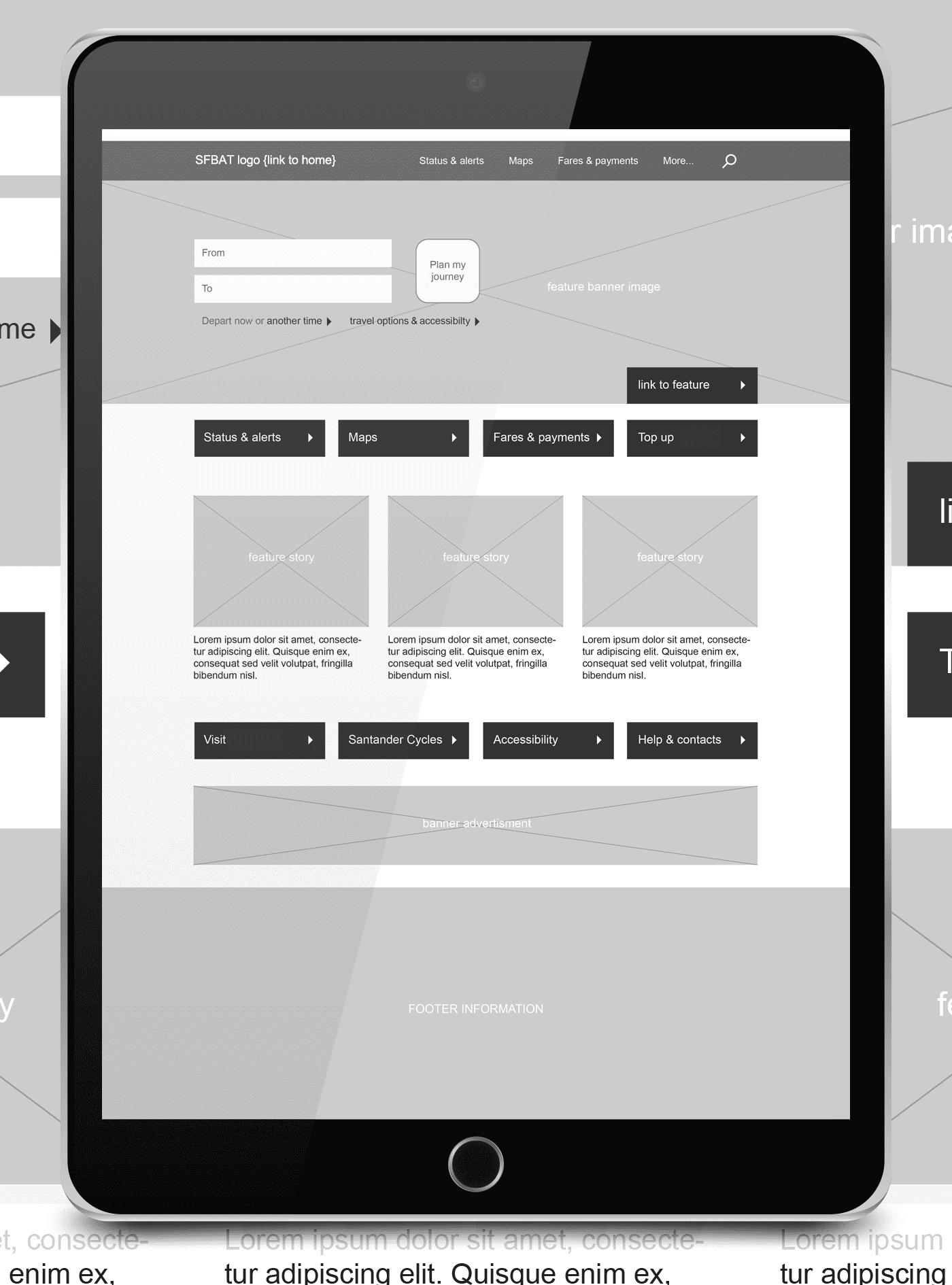
Prototyping & More prototyping
Prototypes were created to test many different ideas and challenges. We evaluated various designs to test theories and assumptions with users. Results provided specifications needed to build real, working systems.
One example was looking at how public transit in the Bay Area requires that commuters learn a dozen different fare structures. People with long commutes—many of them low-income, many who must use multiple systems every day—are financially penalized. And individual agencies are not given incentives to help passengers navigate a trip beyond the end of their line. An easy to use and accessible app that is connected to a single payment system would greatly simplify things.
One example was looking at how public transit in the Bay Area requires that commuters learn a dozen different fare structures. People with long commutes—many of them low-income, many who must use multiple systems every day—are financially penalized. And individual agencies are not given incentives to help passengers navigate a trip beyond the end of their line. An easy to use and accessible app that is connected to a single payment system would greatly simplify things.
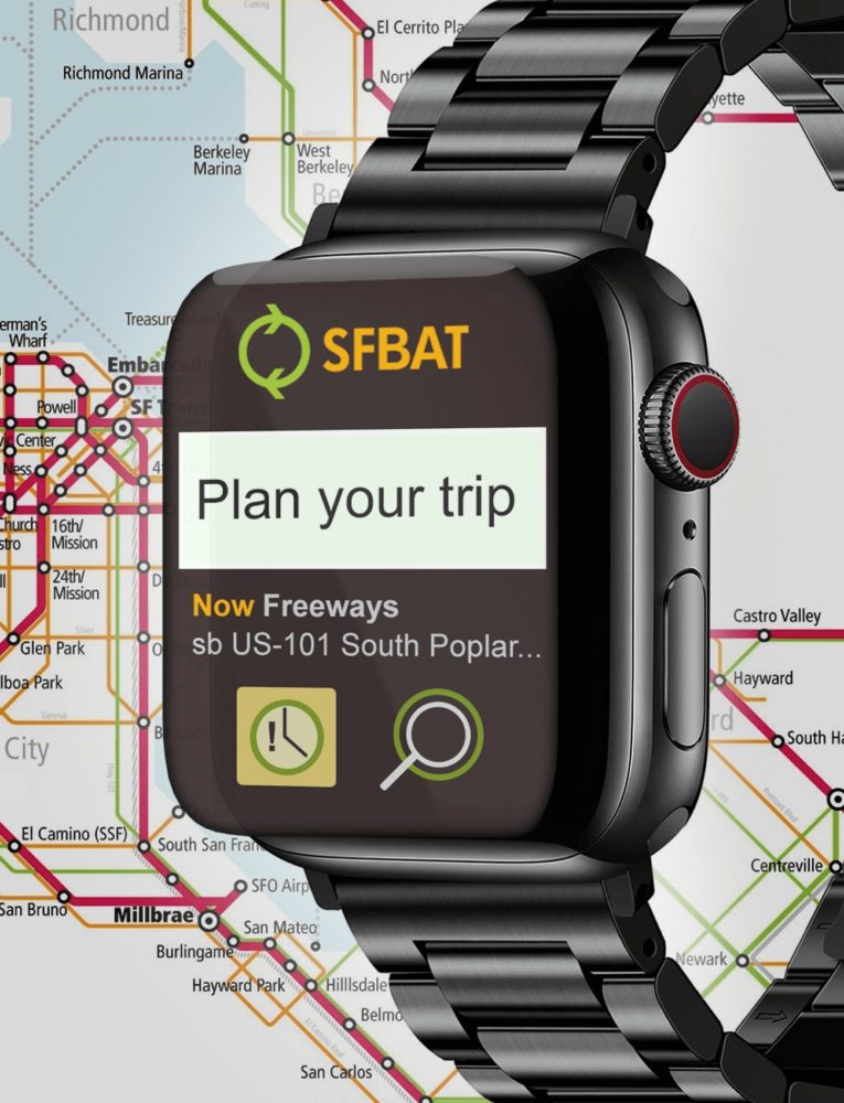
Watch App for Android & iOS
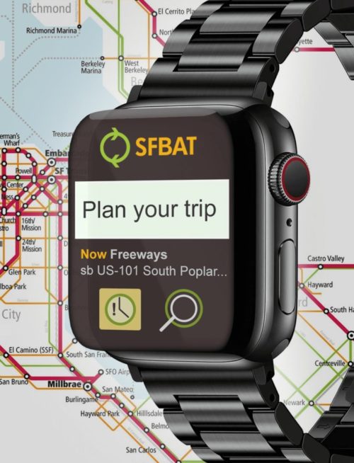
Watch app designs for the SFBAT project were inspired by the Google Maps Apple Watch application. As one of the most comprehensive navigation services, Google Maps can help you get where you need to go even on the smallest of screens. The focus was to maximize the smaller, more immediately accessible display.
One example you don’t see a map on the app. Instead, you get a choice of navigating to your desired destinations via car, bike, public transport, or walking. Once you’ve entered your destination, and then selected your mode of transport, you’ll get a list of step-by-step instructions complete with haptic alerts to make sure you don’t miss a turn.
