United Nations

UN WOMEN logo design

Logo and identity design

The UN Women mark is rich in symbolism, which combines three recognizable symbols: the globe, the women’s symbol, and the equal sign. The mark is divided into two halves, represented by different shades of blue, and connected by the equal sign.

The symbolism of the mark expresses the organization’s commitment to creating a world in which women and men are equal. The United Nations logo was added later to the original proposal. The principle was to accent the department’s role as an obvious UN entity. In addition, the mark needed to be highly legible across all media both on screen and in print, large and small.
UN WOMEN logo design

Make it global

UN Women mark was also designed to accommodate multiple languages. It is available in Arabic, Chinese, English, French, Russian, and Spanish. We also created the mark with the option to include a full-name tagline. This application can be used when it is beneficial for the target audiences to have the UN Women name fully spelled out and add the necessarily information for specific uses.

UN WOMEN poster

Logo application

UN Women’s name and logo is a true asset for the United Nations Women organization, since it encapsulates their values and is the cornerstone of their visual representation. The logo in tandem with multiple types of design such as digital media, advertising, conference themes, public advocacy, and informational materials must be strong in expressing their mission to stand for gender equality and the empowerment of women. The example (left) is a design and illustration created to promote awareness of the impact of disease on women in Indonesia.
UN WOMEN logo creation

Logotype ideation process

The first step was to create a brand strategy. This defining of a clear purpose and framework provided the foundation upon which many concepts could be explored. Understanding the organization, its positioning, and mission and values was well documented before ink met paper.

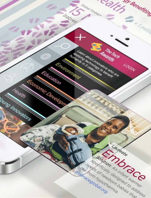
The example (left) is an example start where we used concepts, ideas and keywords from the brief and clustered them into various theme visualizations. It was helpful to map out the clichés, symbols, icons, and well-established visual language for each theme. We considered the crossover ideas, the scope for development, and the potential to create something distinctive.
UN WOMEN infographics

Infographic design

We had to consider how the logo fits within a bigger picture. This meant understanding that there are many global-related requirements, working with a large volume of statistics, and piecing all the organization’s different services and products together. Creating information design visual solutions was a key part of the branding project.

The example (left) shows how we executed on how the mark can perform in multiple different areas. A visual system for designing infographics was created to serve a big segment of the United Nations Women needs to communicate messages.
UN WOMEN public awareness

Public awareness campaigns

Publications templates were designed to create a harmonized visual identity for UN Women’s print products and publications. The templates provide a framework for UN Women’s Technical Publications (Policy Briefs, Guidance Notes, Manuals etc.), Information and Advocacy Products, Academic Papers, Briefs and Brochures.

The three examples (left image) show how the mark works in various ways. Example 1 the layouts follow the poster tactic where image leads with attention, and logo finishes with authentication. Example 2 the logo works together with rhetoric to engage thought. Example 3 illustrates how the mark works in a partnership format, where a support organization is in play.

All projects