New HP Identity
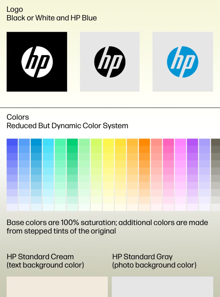
New identity design
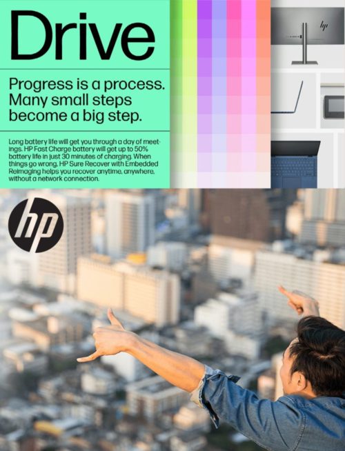
The goals were to [1] make HP identifiable, [2] create unity and cohesion, [3] develop a pragmatic visual approach that reflects HP ethos and thinking, and [5] consider the brand as a whole and not just individual things.
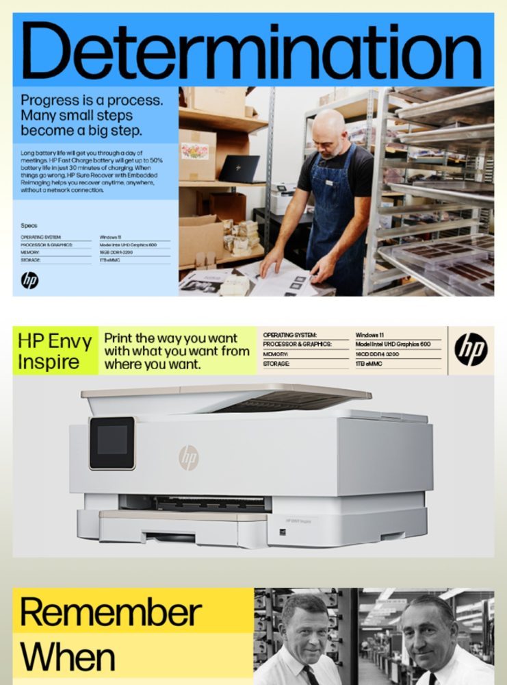
Typography & Photography
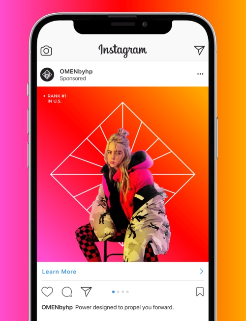
Photography uses a documentary, editorial style that is journalistic in nature. These images capture people and their personal experiences, hobbies, skills, and professions. The hope is that HP will be able to extend these images and stories to other platforms, such as Instagram, You-Tube, editorial, and other media partners.
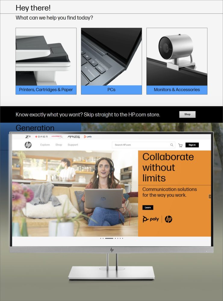
Web site design
A new HP visual identity provided for the perfect opportunity to revisit several factors during the process of redesigning HP.com store. Number one was to consider conversions because we know the longer the user stays on a page, the better the impression. Design plays a large factor in keeping visitors on-site, so it was important to utilize the key benefits of the new visual identity. Clean, open, and organized are the core qualities that help drive results.
The need for speed was critical too. With the amount of content HP serves, we know that attention spans have gotten shorter and shorter. Also we looked at maximizing on a mobile-first priority. The website needed to be more responsive for consistent user experience.
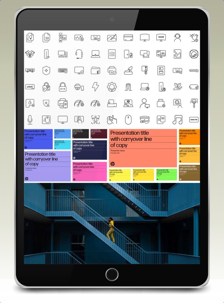
Templates & Pattern libraries
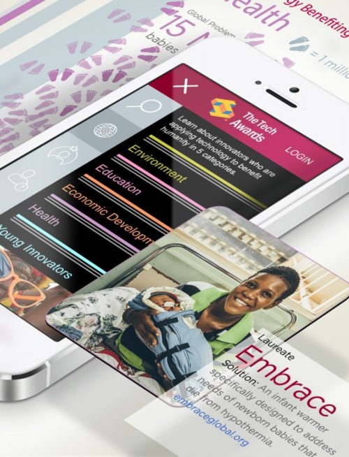
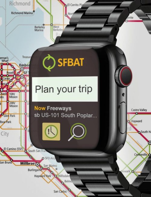
We created an extensive pattern library that includes all the reusable elements for multiple project and application types. This includes the visual design elements like color, typography, icons, layouts, and templates. Libraries also include UI components like buttons, links, forms, navigation, tables, and other repeated modules.
HP Store design
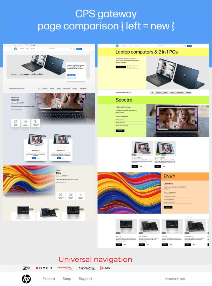
Extensive work was done adapting the new visual identity into HP’s ecommerce website. The site design must attract potential customers, provide great user experience and present HP.com in the best light. We kept the design and navigation clear, clean, and simple enough to keep the focus on the sale. We used the new HP branding as the DNA of the ecommerce business, applying those same principles to connect with HP’s shopping audience.

HP Store design
Every project, every aspect, and every minute of work we were thinking like a website visitor. This helped us to anticipate what they want from the store, and then design to meet those needs. From those learnings we created a robust inventory of sales and marketing detail pages. This was a benefit both on the creation and production sides of the process.
Content was made to be scannable. Our research showed that most website visitors only read about 20% of the text on any given web page. We also expanded on social proof to build trust. Positive feedback from existing customers, testimonials, and influencer videos provided a big boost to sales.
Web specifications
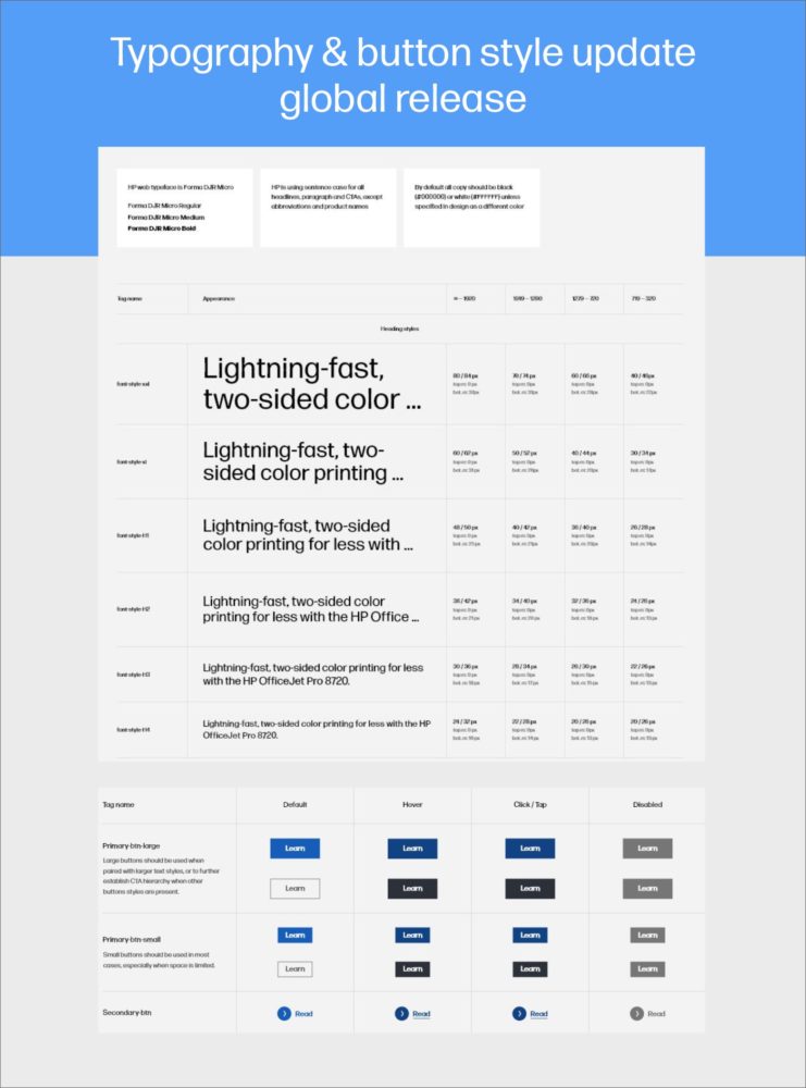
The extent of the new visual identity project covered every possible need. No aspect was too small or forgotton. The example (left) is one example of many illustrating the extensive documentation created for HP’s website specifications. These standards and guidelines were then shared and implemented to dozens of HP Stores across the globe. We had to make it easy and accessible to a great number of contributors, specialists, and agencies who are in a constant state of content creation and execution.
